Nintendo Almost Got A Terrible New 'Edgy' Logo
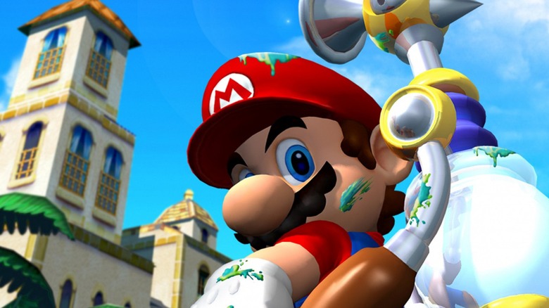
Someone call Mario and tell him to bring the F.L.U.D.D. pack. According to a new interview with former Nintendo of America COO Reggie Fils-Aime, we came embarrassingly close to a goofy version of the classic Nintendo brand logo.
While speaking with Present Value Podcast (via VG247), Fils-Aime described several internal conversations regarding Nintendo's brand that occurred over his years with the company. There were supposedly concerns that Nintendo was seen as too much of a children-only brand.
"When I joined Nintendo, there was a sense of almost shame that Nintendo appealed to young consumers," explained Fils-Aime, "and the marketing team at Nintendo of America started doing things with the logo – that classic Nintendo logo in an oval – they would put it into graffiti style, or they'd do different things to try and age up the logo."
The idea of a graffiti-styled Nintendo logo seems ridiculous now, but it wasn't really out of the question during the early 2000s. Nintendo had dominated the gaming landscape for so long that it must have seemed like the right time to try to hang with seemingly "more adult" brands like PlayStation. It's also worth noting that the 2000s saw several companies making big leaps to try to seem more hip and current. RadioShack briefly changed its name to The Shack in 2009, so the idea of a new logo for a well-established company doesn't seem quite as bonkers in comparison.
Fils-Aime explained that he shot down the attempts at creating a new logo for Nintendo. Instead, he says, the company "created messaging coupled with content that really broadened the reach, broadened the appeal." In other words, Nintendo realized that the audience was already there for more mature titles; it just had to make sure it was communicating with those fans as a company.
It's kind of wild to imagine a world where Nintendo went through with a rebrand like that. It makes you wonder how long that would have stuck — like New Coke before it — until Nintendo gave into fan demands and restored the classic logo. Luckily, we don't live in that dark, graffiti-filled timeline.

