Why The North American SNES Looked So Different From The Rest Of The World's Consoles
The release of new generations of video game consoles is always exciting. There are always tons of new features for players to explore, an uplift in processing to showcase more detailed graphics and a variety of launch titles that take advantage of these new technologies to get fans excited. That said, there's another aspect of generational upgrades that isn't always discussed as often: design. It might not seem all that important compared to the machine's technical capabilities, but manufacturers put a lot of thought into the physical design changes between console generations. This goes back to the early days of home gaming.
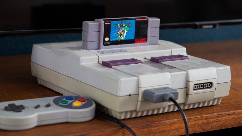
One of the most popular video game consoles Nintendo ever made was the Super Nintendo Entertainment System (SNES), released in 1990 and featuring popular titles such as "Super Mario World." This was the second console created by Masayuki Uemura, following the original Nintendo Entertainment System, and it actually had two distinct designs. One for its release in Japan and one for its release in America. The original Japanese console was called the Super Famicom, following the naming scheme established by its predecessor, but Nintendo changed its design and branding considerably for its American release. This offered a unique appearance to help distinguish it not just from the Super Famicom but from the rest of the world's consoles too. Here's how the Super Famicom and SNES differed and why Nintendo decided to make the changes.
Super Famicom design vs. SNES
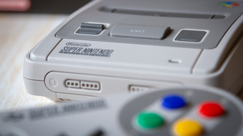
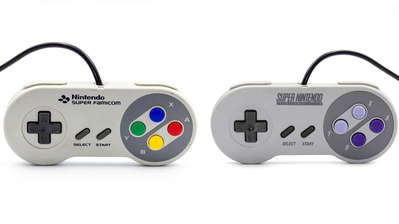
While all the buttons and ports on both consoles remained more or less the same, and both could play all the same games at all the exact specifications, the plastic housings that contained the Super Famicom and SNES differed in several ways. The Japanese Super Famicom was designed to look like a natural progression of the original Famicom. It had an all-gray color scheme (except for the rainbow flower symbol on its back right), rounded corners, and a generally smoother look. In addition, it had three distinct interfaces below the cartridge port: a power toggle, a raised eject button, and a flat reset button.
In contrast to this design, the American SNES was more jagged and angular. It had the same three interfaces below the cartridge port, but the power and reset were both sliding purple switches that gave the system a pop of color and provided more symmetry. Even the controllers that came with the consoles were slightly different — keeping the same general layout but replacing the convex blue, green, red, and yellow A, B, X, and Y buttons with ones that again came in two shades of purple, with the lavender X and Y buttons being concave. So, why did Nintendo decide to make these changes?
A more practical design and a more ergonomic controller
Author Dominic Arsenault discussed why Nintendo gave the American version a unique redesign in his book, "Super Power, Spoony Bards, and Silverware: The Super Nintendo Entertainment System." According to Arsenault, the SNES, which was designed by American industrial designer Lance Barr, was meant to appear more like a piece of home entertainment equipment such as a VCR. This angular design would also be more conducive to expansions being plugged into the port at the bottom of the device. At the same time, the uneven surface would prevent people from setting their drinks on top of the console and risk getting it wet. On top of all the noticeable differences, there was also chemical flame retardant that was added to the plastic. Unfortunately, this ended up being the cause of the unpleasant yellowing on these consoles as they age.
The changes in the controller seemed to have been both stylistic and practical. They were slightly larger, to start. They also had a two-tone gray and purple color scheme that better matched the new console, while the concave X and Y buttons made it easier for users to distinguish the buttons by touch so that they wouldn't have to tear their eyes off the on-screen action to orient their thumbs.
So, while the SNES design for Americans was intended to make it look more like a VCR, it has gone on to become an iconic staple of retro gaming aesthetic.