Iconic Video Game Characters That Almost Looked Way Different
The right character can make a good game great — and the wrong one can tank an entire franchise. Mega Man, the Mario brothers, the Pac family, and Master Chief? All cool, iconic classics. Has-beens like Bubsy the Bobcat, Watch_Dogs' Aiden Pearce, or Shadow the Hedgehog? Not so much.
Creating a truly memorable video game character, however, takes more work than just the right look at the right time, and even the most talented character artists rarely nail things the first time around. Like the rest of game development, character design is an iterative process. You try something, test it, and then refine and revise until it works. That's why the following characters almost looked so wildly different. If you play a lot of video games, you absolutely know the following men, women, and assorted creatures — but going by their early designs, you'd barely recognize 'em. Go ahead. Take a look.
Hunting for the right look for BioShock's Gatherers
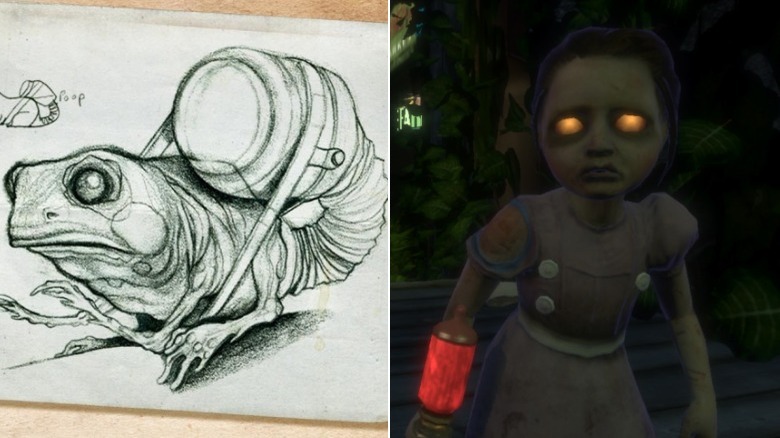
It's hard not to feel bad for Bioshock's Little Sisters. The pint-sized tykes didn't ask to be genetically modified or pumped full of ADAM, the drug that allows Rapture's citizens to weaponize their DNA, and they certainly didn't sign up for the player to hunt them down, kill their protectors, and suck the life out of 'em. Squint when you look at them and the Little Sisters are even kind of cute — sort of, anyway.
That wasn't always the case. While the designers at Irrational Games knew early on that they wanted Rapture to be filled with creatures known as Gatherers, they weren't sure what forms the characters would take. In fact, at first, the Gatherers were slimy slugs. The problem with that, BioShock concept artist Robb Waters says, is that the gross design made it hard to empathize with the Gatherers. "It was kinda cool looking," Waters says, "but you didn't care if you beat it to death."
So, Waters and his team went back to the drawing board. They pumped out designs that included frogs with ADAM canisters attached to their butts, a dog in a wheelchair, chipmunks, robots, and more. Eventually, Waters' team decided to put an old woman's face on a little girl's body. That was the turning point. At director Ken Levine's behest, BioShock's artists used that concept as a springboard to merge cute and spooky into one design, and voila! The Little Sister was born.
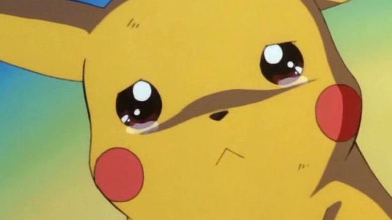
Pikachu, I choose — rice cakes!
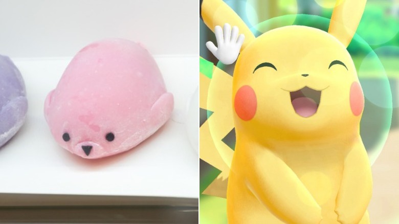
Thanks to the Pokémon anime, Pikachu is the de-facto face of the Pokémon franchise. How could he not be? He's just too darn cute. At the outset, however, Nintendo and Game Freak had a very different look in mind for the electric pocket monster. As artist Atsuko Nishida tells Siliconera, when she arrived at Game Freak, she was simply told to design an electric-themed creature. There were no other notes, and in that vacuum, Nishida came up with a character that she describes as daifuku — a type of sweet Japanese rice cake — with ears.
Sadly, Nishida made the artwork directly in-game, so no sketches of Pikachu's original design survive. The daifuku-like aesthetic didn't last long anyway. Nishida dubbed her creation Pikachu, and while game designer Koji Nishino liked the name, he wanted the creature to be even cuter. Meanwhile, Nishida decided that Pikachu would store his electricity in his cheeks, similar to how squirrels carry their food, and that he should have a lightning bolt-shaped tail.
You might've noticed a big hole in this story: Nishida was asked to design three evolutions for the pocket monster, but Pikachu only has two. Its third and final evolution, Gorochu, ended up getting cut — not because it was too scary, the developers say, but because it simply unbalanced the game
Tofu, rabbits, and squids, oh my!
It didn't take long for the Inklings to rise to the top of Nintendo's ranks. It's only been a few years since Splatoon debuted on the Wii U, and yet the game's plucky heroes are already making featured appearances in Nintendo crossovers like Mario Kart 8 and Super Smash Bros. Like the rest of Splatoon, the Inklings simply ooze style — but it could've been different. Originally, the Inklings weren't nearly so fresh — and they didn't make a whole lot of sense, either.
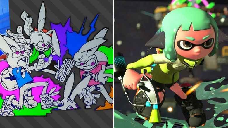
Splatoon started life as a Yoshi-themed title, but before long Nintendo realized that the spray 'n play turf wars were better suited to original characters. Early in development, blocks of tofu stood in for the ink-slinging heroes, but as production continued the soy curds were replaced by rabbits. As producer Hisashi Nogami explained at the Game Developers Conference, rabbits are fiercely territorial, which fits in nicely with Splatoon's territory marking gameplay. But why are rabbits shooting ink? Why are they swimming through it?
Change the characters to squids, however, and everything makes a lot more sense. Still, Nintendo didn't hit upon human-looking cephalopods right away. Initial Inkling designs looked like Super Mario Bros.' Bloopers wearing t-shirts and shoes. It's funny, but also kind of weird, and we're glad that the big N decided to go with the hybrid squid-kids instead. Splatoon's legions of fans probably agree.
Kratos, king of the jungle
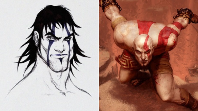
Before Kratos had a kid and embraced his softer side — kind of, anyway — he was a true man's man. He killed anyone and everyone who so much as looked at him funny. He lured beautiful women to bed with a mere snap of his fingers, and left them behind just as quickly. He looked almost exactly like a Disney prince.
Wait, what?
Believe it or not, but it's true. The early concept art tells the story. Instead of a cynical, world-weary warrior with nothing else to lose, Kratos' initial designs depict a lanky, affable adventurer who smiles and sports a full head of hair. Heck, he even has dimples. Thankfully, that didn't last. According to God of War concept artist Erik San Juan, Kratos' look didn't click until someone scrawled a quick sketch on a napkin, using Disney's take on Tarzan, Edgar Rice Burroughs' vine-swinging jungle hero, as reference. Look closely, and you can see the similarities, especially in proto-Kratos' jawline and his mop of hair.
From there, things got refined further. Kratos' unkempt 'do transformed into dreadlocks and braids before disappearing entirely, while a goatee helped balance out Kratos' sharp facial features. Add in Kratos' signature white skin and red paint, and suddenly the Ghost of Sparta looks like we all remember him — and much better for it.
Ox King or King Koopa?
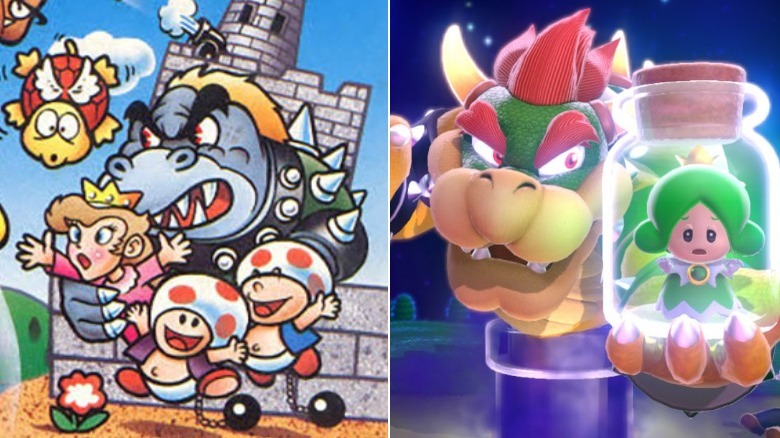
Most members of Super Mario's ever-growing cast of characters emerged more or less fully formed. Mario's changed a bit over the years, but he's always had his moustache and his overalls. Princess Peach has worn the same pink dress since the very beginning. Fans continue to debate whether Toad's mushroom cap is a hat or part of his head, but either way, he's had it for the long haul.
The same can't be said for Mario's arch-nemesis, Bowser. The king of the Koopas didn't just go through some design changes during Super Mario Bros.' development: his original look made its way onto some official release materials, including the game's Japanese box art, which was drawn by Mario creator Shigeru Miyamoto himself. See, Bowser wasn't always just a bigger, meaner version of Super Mario's Koopa Troopas. When designing the big bad, Miyamoto used the Ox King from the anime film Alakazam the Great, itself an adaptation of the Chinese novel Journey to the West, as inspiration.
That's nonsense, of course, and the end result was kind of a mess. "I'd been drawing something completely incomprehensible," Miyamoto admits, "a turtle's body with an ox's head!" Thankfully, Nintendo artist Yōichi Kotabe came to the rescue. Kotabe surmised that, if Bowser was leading an army of turtles, he should probably be a turtle himself. Miyamoto agreed, and Bowser's final design clicked into place.
Ivan the Space Biker lives!
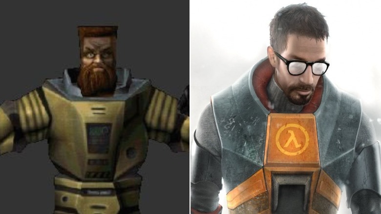
You don't see Gordon Freeman much when you play Half-Life. The game and its (one and very much only) sequel are first-person shooters, and you spend most of the game observing the world through Gordon's eyes. That hasn't stopped the good doctor from becoming a video game icon, though. After all, starring in two of the most critically-acclaimed games ever made has its benefits.
If you dig deep into Half-Life's data, however, you can catch a glimpse of what could've been — and it is horrifying. Instead of a bespectacled, geeky hunk, Freeman was almost a deranged madman with a ZZ Top beard, a flat top, and eyes filled with rage. Just look at him. The would-be space murderer even has his own name — both Valve employees and fans refer to the alternate Mr. Freeman as "Ivan the Space Biker," which works pretty well — and if he'd been allowed to live, we're pretty confident that Half-Life would've felt very, very different.
Valve eventually came to its senses and changed Freeman's design, but you can still find Ivan in the game's original data, too. Install the original Half-Life on your machine and look for a file called "doctor.mdl." Yup, that's Ivan in all of his psychopathic glory, just lurking on your computer and waiting for the perfect time to strike.
Fuzzy Sora will melt your heart
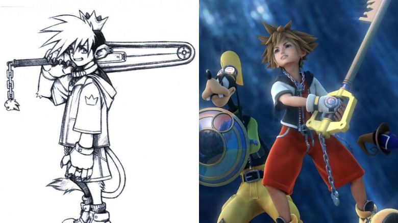
You don't have to be a big Kingdom Hearts fan to recognize Sora, the series' main hero. If the floppy board shorts, round sneakers, and spikey 'do don't ring a bell, then the boy's signature weapon, the Keyblade, certainly will. Well, guess what? Not only did preliminary versions of Sora wield an entirely different weapon, but early on, he wasn't even human.
According to no less of an authority than Tetsuya Nomura, the concept artist who rose through the Square Enix ranks to become Kingdom Hearts' creator and director, Sora's original design was much more "beast-like" than his final incarnation. In an interview translated by Andriasang, Nomura tells Japanese gaming mag Famitsu that Sora was envisioned as a mix between a human and a lion, complete with a tail and animal-like ears. Early concept art reveals that Sora also had paws instead of hands, and that the Keyblade was nowhere in sight — instead, Sora armed himself with a regular old chainsaw.
The idea behind the beastly design was to make Sora fit in among Disney characters like Donald, Goofy, and Mickey, who are all animals. In the end, however, the hero's more animalistic features were dropped — you see, Final Fantasy IX's protagonist, Zidane, already had a monkey-like tail. Some good news, though: if you're bummed that we never got a furry Sora, keep an eye out. When the kid visits the world of Monsters, Inc. in Kingdom Hearts III, he's a whole heck of a lot fuzzier than normal.
Sonic v Eggman in the court of public opinion
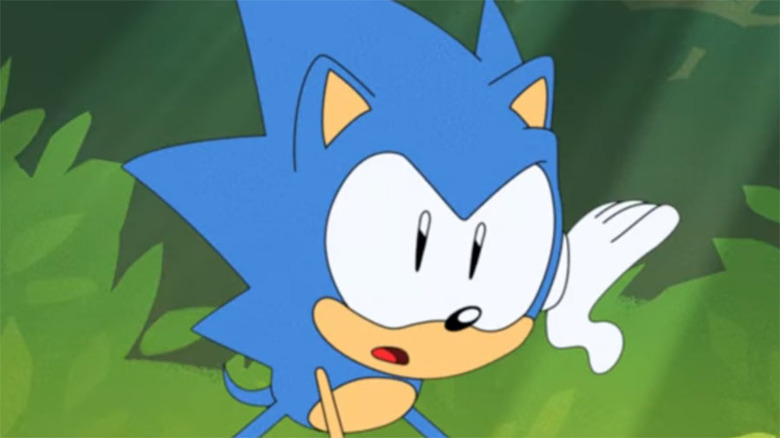
If you can't figure out what your new, modern mascot should look like, go ahead and let the public decide. That's what the folks at Sega did, and it worked out pretty well for them. By the time that the '90s rolled around, it became clear that Sega's first figurehead, Alex Kidd, wasn't getting the job done, and the company set out to find a new character that could give rival Nintendo's Mario a run for his money.
Sega higher-ups requested to see designs for "something like a hedgehog or porcupine," a dog, and an old man with a mustache (remember, at this point, Mario mania was in full swing). From there, though, people had problems narrowing things down. Designer Hirokazu Yasuhara decided to take things into his own hands. While visiting New York City, Yasuhara stopped by Central Park with his character sketches in tow. There, he asked civilians which design they preferred. The hedgehog was the overwhelming favorite, followed by the human, and then the dog.
That clinched it. The hedgehog became Sonic, the man became his arch-nemesis Dr. Eggman, and the dog was taken out behind the barn, never to be seen again. Now, nearly three decades later, Sonic has starred in dozens of games, a record-breaking comic book series, multiple cartoons, and plenty more. Good job, folks. You chose correctly.
But where did those bracelets come from?
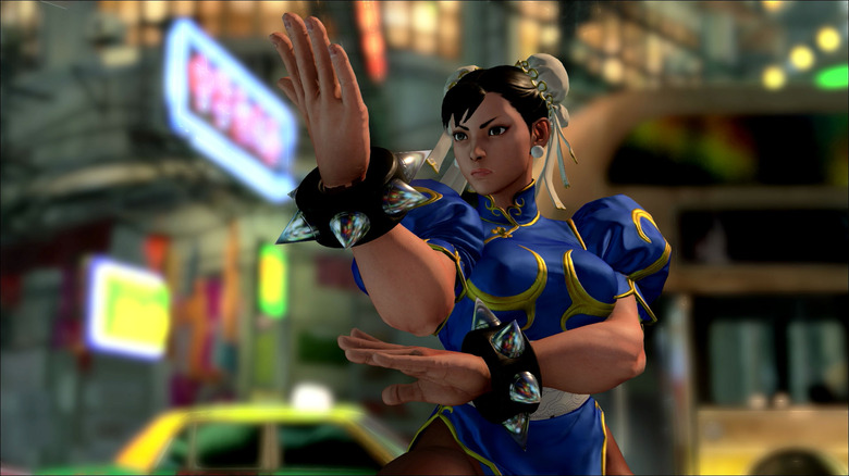
If Ryu is Street Fighter's mascot, then Chun-Li is its supporting lead. Sure, Ken Masters might've gotten there first, but he's really just Ryu's player two. Chun-Li, on the other hand, is her own woman. If you don't recognize her from her famously thick thighs — a design element that Street Fighter II's lead character artist Akira Yasuda is weirdly passionate about — then Chun-Li's signature outfit will probably get the job done.
See, like the rest of Street Fighter II's original world warriors, Chun-Li dresses in clothes that reveal her country of origin. Most of the time, Chun-Li wears a qipao, a Chinese dress that was extremely popular in the '20s and that is enjoying a small resurgence and sparking all kinds of controversy in the modern day. Her hairstyle is informed by her background, too: "ox horn" buns are typically worn by Chinese children on special holidays.
It's a look that's both feminine and tough, and it suits Chun-Li's character nicely. That's why it's so weird that Capcom originally envisioned something entirely different. While Chun-Li's heritage was always a big part of her character (at one point during production, she was known as "China Daughter"), her clothes didn't always reflect it. In fact, at first, she was a hardened soldier wearing military garb. Capcom probably made the right call changing that, especially since we got a military-themed heroine a few years later when Cammy joined the roster.
From knock-off to heartthrob
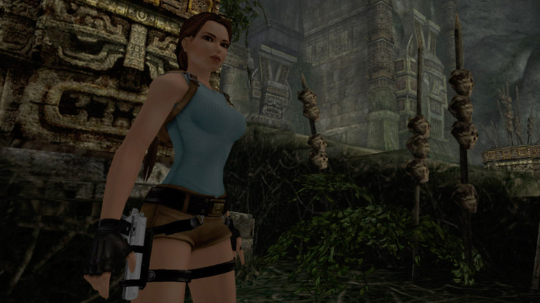
As an adventurous archeologist, Lara Croft owes a lot to good old Indiana Jones, but that debt was almost bigger. A lot bigger. When Core Design artist Toby Gard first came up with the idea for a 3D action game set amid the remnants of ancient civilizations, his hero was basically Indy in everything but name. Core loved the idea of the game, but worried about the lead character's legal ramifications, and asked Gard to come up with something more original.
At the time, video games were one big sausage party, so Core Design's president Jeremy Heath-Smith decided that a female lead would help the game stand out. But he didn't come up with Lara right away; at various points, Tomb Raider's hero was a hip-hop fan with a flat top, an icy blonde, and even a "Nazi-like militant in a baseball cap." Eventually, Gard came up with a tough Latina woman named Laura Cruz, whose name and ethnicity was later changed to appease Eidos, Core Design's British owner.
Even then, the old-school Lara didn't have that curvy figure she later became famous for. In fact, Lara's oversized bosom was an accident: while adjusting Lara's proportions, Gard accidentally increased Lara's bust size by 150%. Gard wasn't pleased with the results, but the rest of Core Design was, and Lara went on to become both video gaming's first-ever sex symbol and one of its biggest stars.
Grounding the Space Invaders
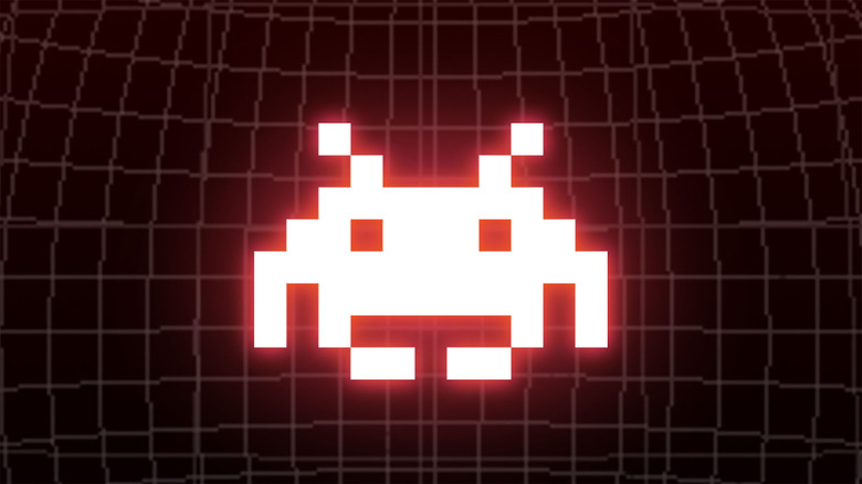
It's hard to think of characters that've had a bigger impact on the video game industry than Taito's blocky little aliens. Without Space Invaders, we never would've gotten Mario, Solid Snake, or countless others. Deus Ex creator Warren Spector gives the pixelated extraterrestrials credit for elevating video games from a passing fad into an artform — at the very least, they helped save at-home console gaming from a very early demise.
Those are just a few reasons why the Space Invaders are so iconic, and it's hard to imagine a world without them. And yet, we almost lived in one. When creating his most famous game, designer Tomohiro Nishikado didn't start with a science-fiction theme. Originally, Space Invaders was a war game. As revealed in The Guardian's 40th anniversary Space Invaders retrospective, the game's original enemies looked like tanks, then ships, and then planes.
None of those worked well the characters' specific and unique movement patterns, however. Foot soldiers sold the illusion just fine, but Nishikado didn't use them because, at the time, "shooting people was frowned upon" (clearly, video games have changed quite a bit since the '70s). With more realistic options off of the table, Nishikado turned to the one-two punch of Star Wars and H.G. Wells for inspiration and put aliens in the game instead. The results speak for themselves.