Tiny Font That Almost Ruined Great Games
There are usually two distinct camps when it comes to video games: those who just come for the gameplay, and those who want all of the background lore. Developers often cater to both crowds by providing plenty of background information on characters and locations, but hide it throughout the game world in books or computer terminals so it's unessential for progression in the game.
However, as more and more games pile on the text, a new demon has reared its ugly head: tiny fonts. Screens have become sharper and, thanks to smartphones, gamers have grown accustomed to being extremely close to their screens. This can cause problems if you're trying to read some intricate story elements from the comfort of your couch.
Today, we're looking at some truly impressive games that made one brutal error: font so tiny it almost ruined things. These games were often patched with options to enlarge the text, but some of them were unable to be fixed. Either that, or the developer just didn't bother at all.
It wasn't enough to totally spoil the experience, but it definitely put a sour taste in our mouths and some strain on our eyes.
Doom Eternal went big, but its font didn't
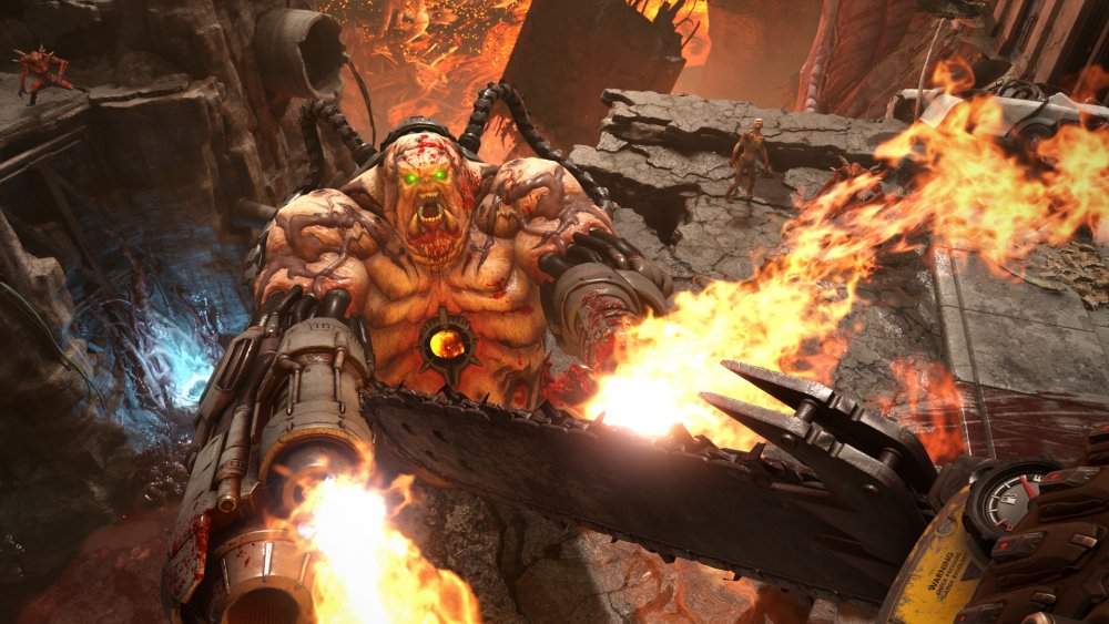
The Doom series has always been an in-your-face experience: you (a big, loud soldier) use your guns (big, loud) or chainsaw (big, loud) to murder demons (big, loud). Everything about the series screams "Death Metal Album Cover Art," but the series resurrection in 2016 saw the curse of tiny font strike Doom. Unfortunately, the developers didn't learn and repeated the mistake with 2020's Doom Eternal.
It doesn't help that the font, in a possible attempt to look futuristic, is a bit strange. It's very narrow, so the bright white color and small print all bleed a bit together. Maybe that's part of the joke – everything else in Doom bleeds, so why not the font, too? Or maybe, as Kotaku surmises, it's supposed to help acclimate the player to the hellscape they find themselves in during the course of the game.
It just seems like an odd choice, with everything else in Doom Eternal being as over the top as possible. Maybe the game will see a patch at some point to help make the text more legible. Or, one other theory: maybe it's Doom Eternal's way of saying "Stop reading and keep killing things!"
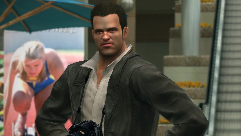
Dead Rising killed your vision
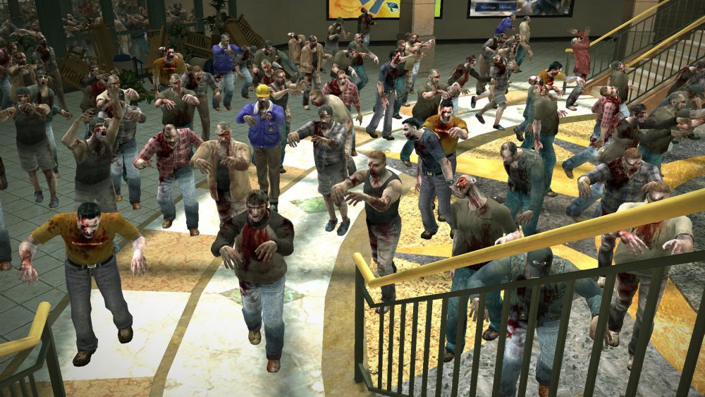
This one is particularly galling because of Capcom's response to the initial complaints. A big reason that Dead Rising's font was so difficult to read was because, at the time of the game's original release, many people had not yet made the jump from standard definition to high definition televisions. As Ars Technica points out, however, the font used was not even easy to read even in HD.
This was a particularly egregious problem in Dead Rising because you often needed the text to tell you where to go or what to do. There was a decent amount of voice acting in the game, but your objectives — or hints about how to accomplish them — often came in written form. If you were playing in standard definition, you were completely out of luck in this regard.
That same Ars Technica piece found a great snippet from a Dead Rising developer in EGM. When the interviewer asked about the small text size, specifically in regards to people who owned standard definition televisions, a member of the Dead Rising team laughed it off and said that people "should definitely have an HDTV before buying an Xbox 360." Thanks for the tip!
The Outer Worlds' text required a telescope
The Outer Worlds was a breath of fresh air for a lot of reasons. On the gameplay front, it had humor, interesting characters and a manageable length that didn't include endless fetch quests. Polygon wrote that it had a wide variety of features that made it accessible, as well. It was playable with the Xbox Adaptive Controller, for example, and because of a co-creator being colorblind, The Outer Worlds was designed with that disability already in mind.
Strangely, it also suffered from severe tiny text syndrome.
There was an option that allowed players to increase the text size, but it made little difference. Unlike a lot of games on this list, the problem was persistent across all instances of text, including dialogue, subtitles, and tutorial screens. Basically, anything you were trying to read was going to be a right pain.
Luckily, Obsidian listened to the outcry and released a patch to increase the font size even more. Then the studio did it again, as fans wanted even bigger text. Now that's quality customer service.
God of War wasn't made for mortal eyes
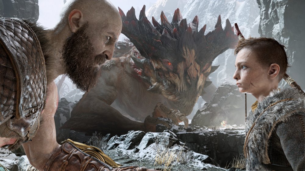
2018's God of War was one of the best games of the year, and helped to bring the classic series up to date after a five year hiatus. It swapped the Greek mythology from the previous games for Norse, and turned Kratos into everyone's favorite dad.
Unfortunately, God of War simulated the player aging up, too — you definitely needed your reading glasses if you wanted any of the text to be legible.
Complaints about the text came flooding in soon after the game's release, and developer SIA Santa Monica quickly released a patch to address the problem. It came in the form of a slider in the options menu that magnified the text size. Problem solved!
Well, not really. The slider hardly made a difference, as plenty of people (like Kotaku's Jason Schreier) pointed out. Oh well. Keep another screen nearby if you want to read all of God of War's lore from your sofa.
Monster Hunter: World had huge monsters and tiny text
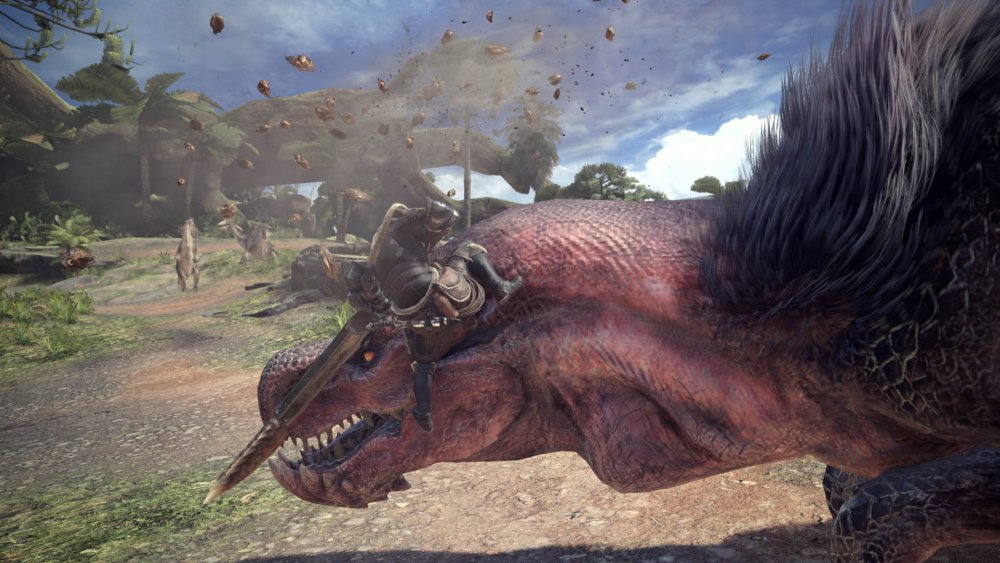
What is it about the latest generation of games and their tiny fonts? Monster Hunter: World was generally seen as a triumphant, mainstream success for the popular series. It continued to add new content through patches and expansions, and players seemingly couldn't get enough of hunting Kirin and Lunastra across the game's beautiful landscapes.
Hopefully you weren't planning on reading too much about those creatures, though. Monster Hunter: World's text was ridiculously small before a few patches came in to fix things.
Over on The Geek Spot, an important point was raised about the tiny text problem that seems to have infected modern gaming: accessibility. For many gamers, it can be frustrating to not be able to see a word or instruction from the couch. For many gamers with disabilities, however, tiny text can render games like Monster Hunter: World unplayable. If you rely on subtitles because of an auditory impairment, it's important that you can actually read those subtitles!
A patch eventually came through that allowed players to alter the size of the text in Monster Hunter: World.
Fire Emblem: Three Houses waged war on your eyeballs
For a lot of games on this list, tiny font is often confined to lore. This isn't always a huge problem. It can affect certain facets of a game if you don't read the lore, but for many gamers, they skip out on backstory in favor of actually playing.
For a game like Fire Emblem: Three Houses, however, you need that text. If you want to truly make the most of your tactical strategy in Fire Emblem, you have to navigate a lot of menus. So, of course, the text in Fire Emblem: Three Houses is tiny.
Kotaku's Heather Alexandria argues that the problem lies in the Switch's small screen. The game's pop-ups are definitely big enough and clear enough to read when your Switch is docked and coming through a big screen. The problem is if you're trying to play the game on the go. The pop-ups are so small on the already small screen that they become impossible to read, meaning you're going to be in the dark about whatever you've just accomplished.
Dragon Age: Inquisition's font was a drag
It's nearly impossible to catch all the text in a massive RPG like Dragon Age: Inquisition if you aren't reading the subtitles. With so many characters and so much dialogue, you need the text to help guide you through exactly what's going on and who is saying what.
That's why it was so distressing that the subtitles in Dragon Age: Inquisition were so tiny. To take it further, the text was practically illegible to many players.
Hundreds of players complained to developer BioWare to fix this egregious issue. Forum posts swiping at the company were common, and there was even a Change.org petition started to "Fix the Subtitling and General Lettering in Dragon Age: Inquisition." It received 442 supporters before being shut down.
The tiny text became a big enough issue that a patch was released just a few months after the game was released; one that thankfully gave players the option to adjust subtitle size. It's nice when the developers listen to legitimate concerns, isn't it?
Ni No Kuni 2: Revenant Kingdom said 'no' to normal font sizes
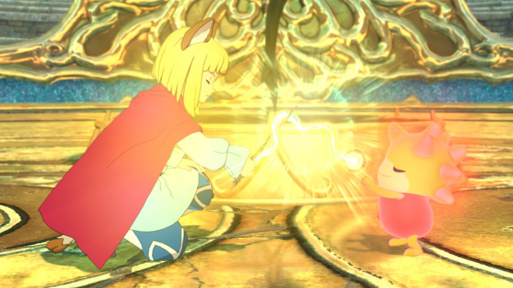
Go ahead and run a Google search for "Ni No Kuni 2 text size." You'll discover there are pages and pages of forum posts, and in these posts, people talk about their setups and how they still can't read the game's subtitles. The basic refrain you see is similar to what you see on this Reddit thread: "I'm playing it on a 50" tv, only about 5' away, but it's so freaking hard to read."
Numerous users have written their only real complaint about the game has to do with the subtitle text. Many have essentially resigned themselves to ignoring any of the in-game subtitles.
It's really too bad, because the text size is the only real issue with Ni No Kuni 2. That said, this is a game from a genre where the storylines and characters are usually pretty far in the weeds. It's pretty easy to get lost if you can't also follow along with the in-game text.
If possible, you might be better off picking this one up on PC so you can sit closer to your screen.
Mass Effect 2's text was a massive pain
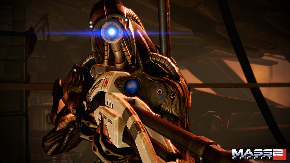
2010 was a bit late in the game for players on current-gen consoles to not have HD televisions. That is understandable. However, it will never get old looking back at developers essentially saying "LOL get a new tv!" when gamers complained about being unable to read text on their standard definition televisions.
This is essentially how the developers at BioWare responded when players contacted them about Mass Effect 2.
Destructoid writes that, in a since-removed forum post, the devs behind Mass Effect 2 did basically that (though they worded it much more tactfully). They called the tiny text issue a "byproduct of the enhancements to the user interface." Then they dropped the hammer: "After investigating potential solutions, we have determined that while this issue does affect a small portion of SDTV owners, we are unable to resolve it for Mass Effect 2 through a title update."
On the bright side, BioWare said it would look into the issue with future titles. And no one complained at all about the text in Mass Effect 3, so perhaps the studio got the message.
Dishonored 2's font is incredibly stealthy
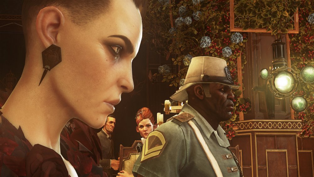
DAGERS is a website that features game reviews from a unique perspective: the disabled gamer. It offers plenty of insight into what games do well by gamers with disabilities and what games do not. Interestingly, the site had nothing but praise for the original Dishonored.
However, DAGERS had some seriously harsh words for one specific aspect of its sequel: the text size.
"Dishonored 2 is also a case study in what can happen when a single barrier is so extreme that it impacts not only every segment of the disabled population but also a large population of the able bodied community as well," said the site's review.
That barrier was the size of the game's subtitles. The site stated that the text size and font choice was so egregious that it not only affected gamers with disabilities, it was also "illegible for even un-impaired gamers."
It's a fascinating review, as Josh Straub went to great lengths to illustrate that everything else about Dishonored 2 was great. However, this single aspect was enough to destroy the game entirely. Ouch.